Introduction to Selectors in CSS
Element selectors are the building blocks of CSS styling. They define which HTML elements will be affected by the CSS rules you write. There are several types of element selectors, each with its own purpose:
Types of Element Selectors
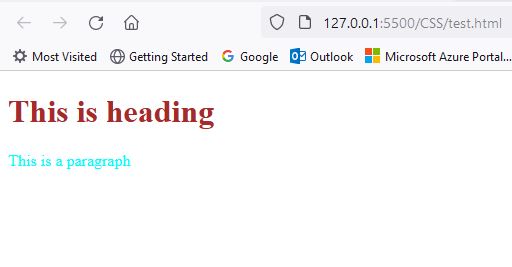
- Tag name selector: Targets elements of a specific tag name (e.g., `p`, `h1`, `img`). Sample code for Tag Selectors is given below
 <!DOCTYPE html>
    <html lang="en">
    <head>
        <meta charset="UTF-8">
        <meta name="viewport" content="width=device-width, initial-scale=1.0">
        <title>HTML Basics</title>
        <style>
           h1
           {
            color:brown;
           }
           p
           {
            color:aqua;
           }
        </style>
    </head>
    <body>
      <h1>This is heading</h1>
      <p>This is a paragraph</p>
    </div>
    </body>
    </html>
Output
<!DOCTYPE html>
<html lang="en">
<head>
<meta charset="UTF-8">
<meta name="viewport" content="width=device-width, initial-scale=1.0">
<title>HTML Basics</title>
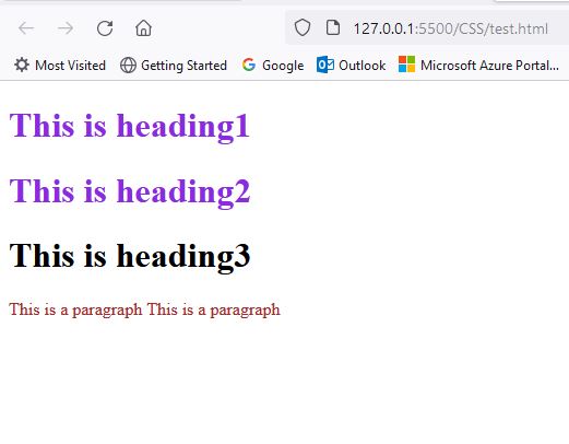
<style>
/*class selector in css*/
.a
{
color:blueviolet;
}
p.b
{
color:brown;
}
</style>
</head>
<body>
<h1 class="a" id="a1">This is heading1</h1>
<h1 class="a" id="a2">This is heading2</h1>
<h1 class="b" id="a3">This is heading3</h1>
<p class="b" id="p1">This is a paragraph</p>
<p class="b" id="p2">This is a paragraph</p>
</div>
</body>
</html> Output
<!DOCTYPE html>
<html lang="en">
<head>
<meta charset="UTF-8">
<meta name="viewport" content="width=device-width, initial-scale=1.0">
<title>HTML Basics</title>
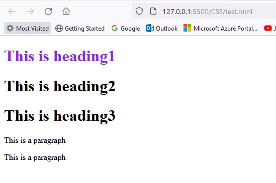
<style>
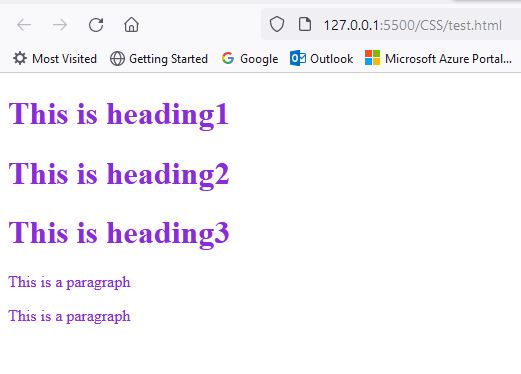
/*id selector in css*/
#a1
{
color:blueviolet;
}
</style>
</head>
<body>
<h1 class="a" id="a1">This is heading1</h1>
<h1 class="a" id="a2">This is heading2</h1>
<h1 class="b" id="a3">This is heading3</h1>
<p class="b" id="p1">This is a paragraph</p>
<p class="b" id="p2">This is a paragraph</p>
</div>
</body>
</html> Output
<!DOCTYPE html>
<html lang="en">
<head>
<meta charset="UTF-8">
<meta name="viewport" content="width=device-width, initial-scale=1.0">
<title>HTML Basics</title>
<style>
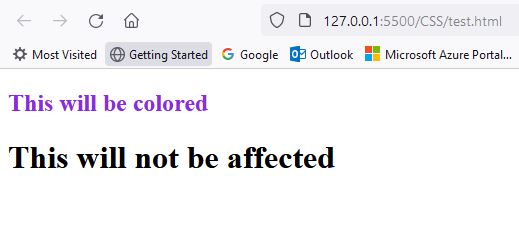
/*descendent selector in css*/
nav h1{
color:blueviolet;
}
</style>
</head>
<body>
<nav>
<h1>This will be colored</h1>
</nav>
<h1>This will not be affected</h1>
</div>
</body>
</html> Output
<!DOCTYPE html>
    <html lang="en">
    <head>
        <meta charset="UTF-8">
        <meta name="viewport" content="width=device-width, initial-scale=1.0">
        <title>HTML Basics</title>
        <style>
           /*id selector in css*/
           *{
            color:blueviolet;
           }
        </style>
    </head>
    <body>
      <h1 class="a" id="a1">This is heading1</h1>
      <h1 class="a" id="a2">This is heading2</h1>
      <h1 class="b" id="a3">This is heading3</h1>
      <p class="b" id="p1">This is a paragraph</p>
      <p class="b" id="p2">This is a paragraph</p>
    </div>
    </body>
    </html>
Output
Styling fonts using CSS
CSS allows you to take control of your website's fonts, transforming plain text into visually appealing and impactful elements. Here's a glimpse of what you can do:
Basic Properties:
- Font family: Choose from a vast library or specify your own.
- Font size: Define the text size in pixels, ems, or percentages.
- Font weight: Adjust the thickness, from light to bold.
- Font style: Apply italics, obliques, or small caps for emphasis.
- Color: Define the text color, choosing from palettes or hex codes.
Advanced Properties:
- Line height: Control spacing between lines for better readability.
- Letter spacing: Adjust space between individual letters for tighter or looser feel.
- Text decoration: Add underlines, overlines, or strikethroughs for emphasis.
- Text alignment: Align text left, center, right, or justify for optimal layout.
- Text shadow: Create a subtle shadow behind the text for added depth.
- Text align: Can be left,right or justify. Aligns text accordingly
- Text transform: Can convert text to uppercase, lowercase or capitalize the first letter of every word
- Word spacing: Used for adjusting the space between words
- text indent: Indents the first line based on the value given
Benefits of CSS Font Styling:
- Improved aesthetics: Visually appealing fonts enhance user experience and brand image.
- Enhanced readability: Optimize size, spacing, and line height for better legibility.
- Emphasis and hierarchy: Differentiate headings, important information, etc., through font styles.
- Flexibility and control: Update and adjust styles across your website easily.
<!DOCTYPE html>
<html lang="en">
<head>
<meta charset="UTF-8">
<meta name="viewport" content="width=device-width, initial-scale=1.0">
<title>HTML Basics</title>
<style>
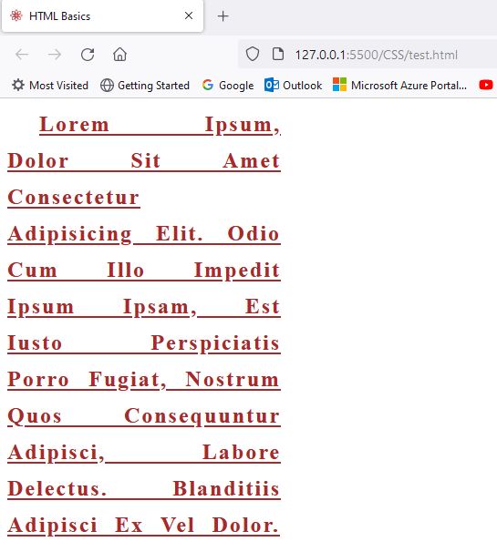
div{
height: 300px;
width: 300px;
font-size: x-large;
font-family: 'Times New Roman', Times, serif;
font-weight: bold;
color:brown;
text-decoration: underline;
text-align: justify;
text-transform: capitalize;
text-indent: 35px;
letter-spacing: 2px;
word-spacing: 10px;
line-height: 40px;
}
</style>
</head>
<body>
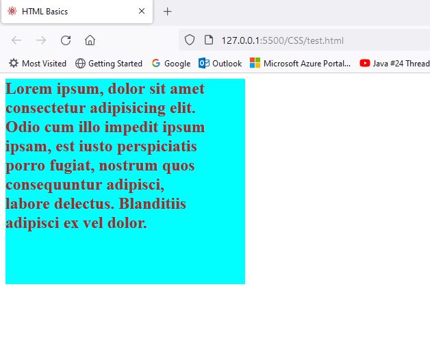
<div>
Lorem ipsum, dolor sit amet consectetur adipisicing elit. Odio cum illo impedit ipsum ipsam, est iusto perspiciatis porro fugiat, nostrum quos consequuntur adipisci, labore delectus. Blanditiis adipisci ex vel dolor.
</div>
</body>
</html>Output
Padding in CSS
Padding in CSS adds that comfy space around the box, giving your text room to breathe and preventing it from feeling squished. It's like a magic wand for creating layouts that are both pleasing to the eye and easy to read!
Why Padding Matters:
- Adds breathing room: Padding prevents text from feeling cramped and uncomfortable to read, especially on smaller screens.
- Improves readability: Text with proper padding is easier to focus on and understand, enhancing user experience.
- Creates hierarchy: Use different padding values for headings, paragraphs, and other elements to visually distinguish them and guide users through your content.
- Enhances design: Padding adds visual balance and proportion, making your layout look more polished and professional.
Controlling Padding: Your Toolbox:
- `padding` property: This sets padding for all four sides of an element. Use values like `10px` or `1em`.
- Individual properties: For more control, use specific properties like `padding-top`, `padding-right`, etc.
- Negative padding (advanced): Overlap elements for specific design effects (use with caution).
- Inheritance: Padding values inherit from parent elements, creating consistent spacing throughout your layout.
<!DOCTYPE html>
<html lang="en">
<head>
<meta charset="UTF-8">
<meta name="viewport" content="width=device-width, initial-scale=1.0">
<title>HTML Basics</title>
<style>
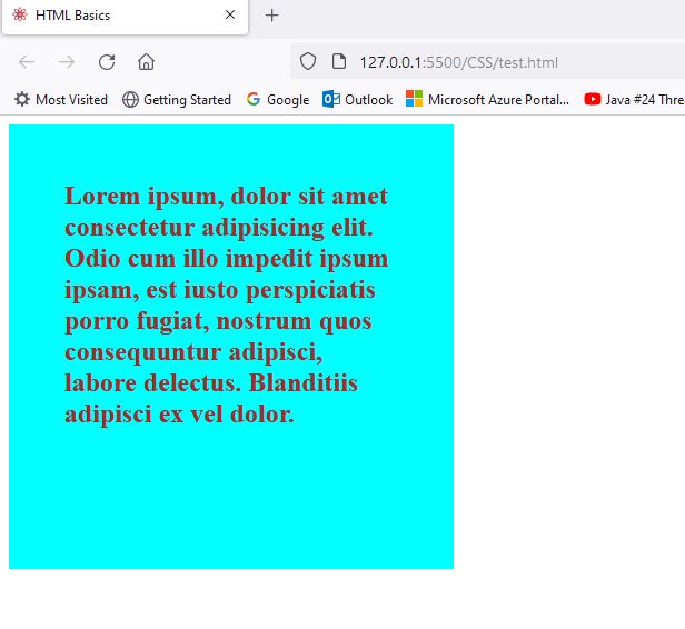
div{
height: 300px;
width: 300px;
font-size: x-large;
font-family: 'Times New Roman', Times, serif;
font-weight: bold;
color:brown;
background-color: aqua;
padding: 50px;
/*other values that padding can take
padding-left: 50px;
padding-right: 50px;
padding-bottom: 50px;*/
}
</style>
</head>
<body>
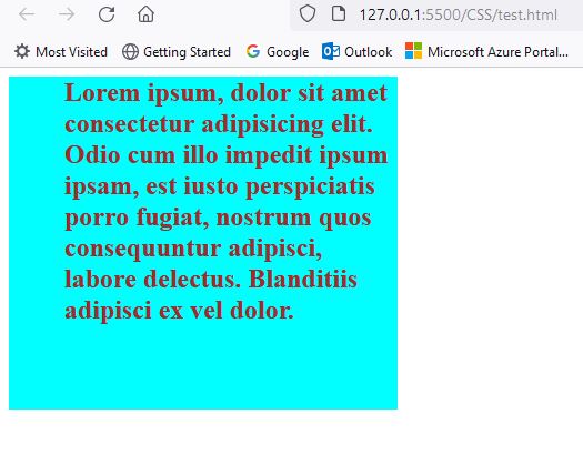
<div>
Lorem ipsum, dolor sit amet consectetur adipisicing elit. Odio cum illo impedit ipsum ipsam, est iusto perspiciatis porro fugiat, nostrum quos consequuntur adipisci, labore delectus. Blanditiis adipisci ex vel dolor.
</div>
</body>
</html> Output Padding
Output Padding-left
Output Padding-right
Borders in CSS
The Power of Borders:
- Define and separate: Borders create clear boundaries between different sections of your page, ensuring clarity and organization.
- Emphasis and hierarchy: Use bolder or contrasting borders to draw attention to important elements and guide users through your content.
- Personality and style: Borders reflect your brand identity or create a specific atmosphere, making your website unique and engaging.
- Visual interest and depth: Experiment with different styles, thicknesses, and shadows to add visual intrigue and dimension to your design.
Border Basics: Your Toolbox:
CSS provides a versatile toolkit for crafting borders:
- `border` property: Sets the style, width, and color all at once.
- Individual properties: Fine-tune your borders with `border-style`, `border-width`, and `border-color`.
- Style options: Choose from solid, dotted, dashed, or even custom patterns.
- Color palettes and thickness: Create subtle accents or bold statements with your color and width choices.
Beyond the Basics: Unleash Your Creativity:
Don't stop at the basics; explore advanced border options to truly elevate your design:
- Rounded corners: Soften the edges with `border-radius` for a modern and inviting feel.
- Border shadows: Add subtle depth with a shadow behind the border using `box-shadow`.
- Floating elements: Create a more dramatic effect with a shadow that extends beyond the border, making elements appear to float.
<!DOCTYPE html>
<html lang="en">
<head>
<meta charset="UTF-8">
<meta name="viewport" content="width=device-width, initial-scale=1.0">
<title>HTML Basics</title>
<style>
div{
height: 300px;
width: 300px;
font-size: x-large;
font-family: 'Times New Roman', Times, serif;
font-weight: bold;
color:brown;
background-color: aqua;
padding: 50px;
/*other values that padding can take
padding-left: 50px;
padding-right: 50px;
padding-bottom: 50px;*/
/*border property*/
border:5px solid brown;
border-right-width: 20px;
border-bottom-width: 20px;
border-left: 10px dotted black;
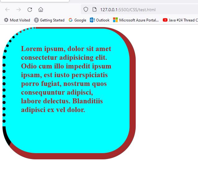
/*rounded corners*/
border-radius: 25%;
}
</style>
</head>
<body>
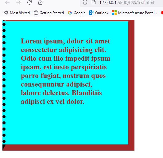
<div>
Lorem ipsum, dolor sit amet consectetur adipisicing elit. Odio cum illo impedit ipsum ipsam, est iusto perspiciatis porro fugiat, nostrum quos consequuntur adipisci, labore delectus. Blanditiis adipisci ex vel dolor.
</div>
</body>
</html> Output Border
Output Border Rounded Corners
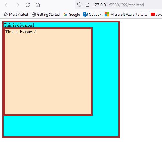
Inherit in CSS
Imagine a family where styles, like font and color, get passed down from parent to child. That's inheritance in CSS!
The Benefits of Inheritance:
- Less code, more style: Define styles once on parents, and children inherit them, saving time and effort.
- Consistency is key: Ensures all elements within a group share similar styles, creating a cohesive look.
- Flexibility at your fingertips: Override inherited styles if needed for specific elements.
<!DOCTYPE html>
  <html lang="en">
  <head>
      <meta charset="UTF-8">
      <meta name="viewport" content="width=device-width, initial-scale=1.0">
      <title>HTML Basics</title>
      <style>
       .parent{
        height: 400px;
        width: 400px;
        background-color: aqua;
        border:5px solid brown;
       }
       .child
       {
        height: 300px;
        width: 300px;
        background-color: bisque;
        border: inherit;
       }
      </style>
  </head>
  <body>
  <div class="parent">
    This is division1
    <div class="child">
      This is division2
    </div>

  </div>
  </body>
  </html>
Output
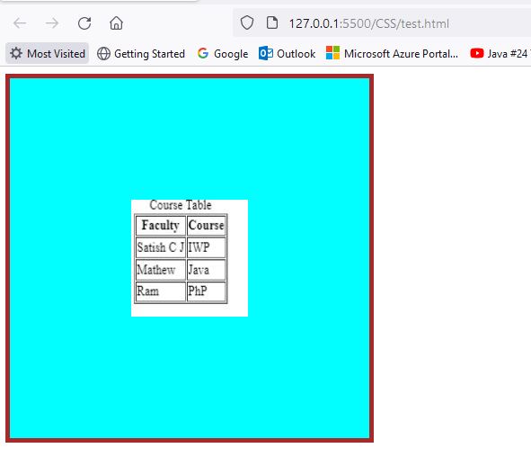
Background in CSS
Background Basics: Your Toolbox:
CSS offers a versatile toolkit to craft your background masterpieces:
- `background` property: Your one-stop shop for color, image, position, and repetition.
- Individual properties: Fine-tune with `background-color`, `background-image`, `background-position`, etc. li>Color palettes: Choose from endless options or create custom gradients.
- Image magic: Include photos, illustrations, or even animated GIFs for visual storytelling.
Beyond the Basics: Dive Deeper:
Master these advanced techniques to truly elevate your design:
- Background size and position: Control how your image fills the element and where it appears.
- Background repeat: Decide whether your image tiles, repeats vertically/horizontally, or appears once.
- Multiple backgrounds: Layer them for complex textures and visual depth.
<!DOCTYPE html>
  <html lang="en">
  <head>
      <meta charset="UTF-8">
      <meta name="viewport" content="width=device-width, initial-scale=1.0">
      <title>HTML Basics</title>
      <style>
       .parent{
        height: 400px;
        width: 400px;
        background-color: aqua;
        border:5px solid brown;
        background-image: url(images/caption.JPG);
        background-repeat: no-repeat;
        background-size: 130px 130px;
        background-position: center;
        /*background position x and y is also possible
        background-position-x: center ;
        background-position-y: center;*/
       }

      </style>
  </head>
  <body>
  <div class="parent">
  </div>
  </body>
  </html>
Output Border