Introduction to CSS Grid Layout
Introduction to CSS Grid Layout
CSS Grid Layout, often simply called "Grid," is a powerful tool for building and arranging elements on a web page. Imagine a flexible grid system where you can define rows and columns, then effortlessly place content within them. Grid empowers you to create complex, responsive layouts with remarkable ease and control
Benefits of Grid Layout:
- Responsive Design: Grid elements automatically adjust their size and position based on available space, ensuring your layout looks great on any device.
- Intuitive Structure: Defining rows and columns creates a clear visual and logical organization for your content.
- Precise Control: Position elements exactly where you want them, with fine-grained control over alignment and spacing.
- Creative Freedom: Unleash your design potential with complex layouts, overlapping elements, and nested grids.
Keyconcepts in Grid
- Grid Container: The parent element that defines the grid environment. Set it with `display: grid`.
- Grid Tracks: Lines defining rows and columns. Create them with `grid-template-rows` and `grid-template-columns`.
- Grid Lines: Intersections of rows and columns, where you place items.
- Grid Items: Individual elements positioned within the grid. Use `grid-area`, `grid-row`, or `grid-column` properties to assign them.
The properties associated with Grid Layout is shown in the table below
| Property | Description | Example |
|---|---|---|
| display | Sets the display type to grid | display: grid; |
| grid-template-rows | Defines the number and size of grid rows | grid-template-rows: repeat(3, 1fr); (3 rows, each 1 fractional unit) |
| grid-template-columns | Defines the number and size of grid columns | grid-template-columns: repeat(2, 200px); (2 columns, each 200px) |
| grid-gap | Creates spacing between grid items | grid-gap: 10px; (10px gap between all items) |
| grid-row-gap | Creates spacing between grid rows | grid-row-gap: 20px; (20px gap between rows) |
| grid-column-gap | Creates spacing between grid columns | grid-column-gap: 15px; (15px gap between columns) |
| grid-auto-rows | Sets the default height for new grid rows | grid-auto-rows: minmax(100px, auto); (min 100px, auto-expand) |
| grid-auto-columns | Sets the default width for new grid columns | grid-auto-columns: minmax(200px, 1fr); (min 200px, 1 fractional unit) |
| grid-area | Assigns a named grid area to an element | grid-area: 2 / 1 / 3 / 2; (spans rows 2-3, columns 1-2) |
| grid-row | Places an element on specific grid rows | grid-row: 2 / span 2; (starts on row 2, spans 2 rows) |
| grid-column | Places an element on specific grid columns | grid-column: 3 / span 2; (starts on column 3, spans 2 columns) |
| justify-items | Controls horizontal alignment of items within tracks | justify-items: center; (center items horizontally) |
| align-items | Controls vertical alignment of items within tracks | align-items: flex-end; (align items to bottom) |
| place-items | Shorthand for justify-items and align-items | place-items: center; (center items both horizontally and vertically) |
| order | Controls the stacking order of grid items | order: 2; (place second in stacking order) |
HTML code for a webpage using CSS Grid Layout
<!--CSS Grid Layout-->
<!--flexbox is used when you need to align a single row -->
<!--Aligning multiple rows and columns -->
<!DOCTYPE html>
<html lang="en">
<head>
<meta charset="UTF-8">
<meta name="viewport" content="width=device-width, initial-scale=1.0">
<title>CSS Grid Layout Tutorial</title>
<link rel="stylesheet" href="mystyle.css">
</head>
<body>
<div class="container">
<header>
Welcome to Codespindle
</header>
<nav>
<ul>
<li>Home</li>
<li>Contact</li>
<li>Register</li>
<li>Feedback</li>
<li>Report</li>
</ul>
</nav>
<article>
<h3 class="mainheading">Best Courses are offered<h3>
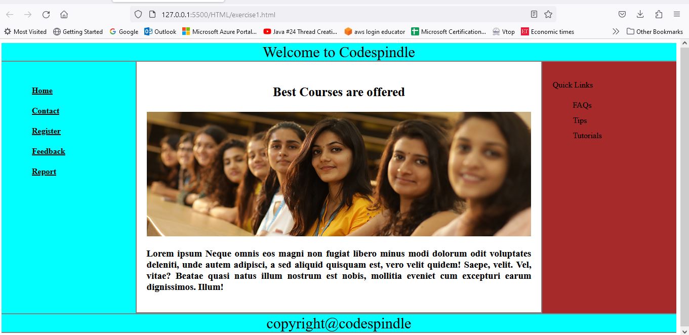
<img src="images/mainimage.jpg" alt="some image is shown">
<p>Lorem ipsum Neque omnis eos magni non fugiat libero minus modi dolorum odit voluptates deleniti, unde autem adipisci, a sed aliquid quisquam est, vero velit quidem! Saepe, velit. Vel, vitae? Beatae quasi natus illum nostrum est nobis, mollitia eveniet cum excepturi earum dignissimos. Illum!</p>
</article>
<aside>
<p>Quick Links</p>
<ul>
<li>FAQs</li>
<li>Tips</li>
<li>Tutorials</li>
</ul>
</aside>
<footer>
copyright@codespindle
</footer>
</div>
</body>
</html> CSS code
  container
  {
      display: grid;
      grid-template-columns:1fr 3fr 1fr;
  }

  header
  {
      grid-column: span 3;
      text-align: center;
      background-color: aqua;
      font-size: 30px;
      border-bottom: 2px solid gray;
  }

  nav
  {
      padding: 20px;
      border-right: 2px solid gray;
      background-color: aqua;
  }

  nav ul li
  {
      list-style-type: none;
      line-height: 40px;
      font-weight: bold;
      text-decoration: underline;
  }

  nav ul li:hover{
      background-color: aqua;
  }

  article
  {
      padding: 20px;
      border-bottom: 2px solid gray;
  }

  article p
  {
      text-align: justify;
  }

  article img
  {
      width: 100%;
  }

  .mainheading
  {
      text-align: center;
      font-size: 25px;
  }

  aside
  {
      padding:20px;
      border-left:2px solid gray;
      background-color: brown;
  }

  aside ul li
  {
      line-height: 30px;
      list-style-type: none;
  }

  footer
  {
      text-align: center;
      font-size: 30px;
      background-color: aqua;
      grid-column: span 3;
      border-top: 2px solid gray;
      border-bottom:2px solid gray;
  }
Output