CSS Box Model - Float - Overflow - Z index - box shadow - display
In this session you will learn the following concepts in CSS
CSS Box Model
The CSS box model is a fundamental concept in web development that defines how HTML elements are displayed on a webpage. It's essentially a box that wraps around every element, composed of four parts:
- Content: This is the actual content of the element, such as text, images, or other HTML elements.
- Padding: This is the clear area around the content. Think of it as a cushion between the content and the border.
- Border: This is the decorative line that surrounds the padding and content.
- Margin: This is the clear area outside the border. It adds spacing between elements and the surrounding webpage.
CSS Box Model Demo
HTML Code for Box Model
<!DOCTYPE html>
  <html lang="en">
  <head>
  <meta charset="UTF-8">
  <meta http-equiv="X-UA-Compatible" content="IE=edge">
  <meta name="viewport" content="width=device-width, initial-scale=1.0">
  <link rel="stylesheet" href="test.css">
  <title>Document</title>
  </head>
  <body>
  <div>
  <img src="images/caption.JPG" alt="its a table">
  </div>
  </body>
  </html>
CSS File for Box Model
img
{
border: 2px solid blue;
padding: 20px;
margin:20px;
float:right;
}

div
{
text-align: justify;
height: 200px;
width: 200px;
background-color: aqua;
}
Output

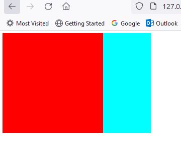
Why Use Z-Index?
- Overlapping Elements: Pop-up notifications, tooltips, and modal windows often need to appear on top of other content.
- Layered Effects: Create engaging parallax effects or interactive elements with different stacking orders.
- Dropdown Menus: Ensure dropdown menus display above the page content for smooth user interaction.
Using z-index effectively requires a bit of strategy. Here are some key points to remember:
- It only works for positioned elements: Elements with
position: static(the default) remain in the stacking order determined by the HTML code. Only elements withposition: absolute,relative,fixed, orstickycan be controlled with z-index. - Higher numbers win: If elements overlap and have different z-index values, the one with the higher number will be displayed on top.
- Specificity matters: When multiple elements have the same z-index, their stacking order is determined by the order in which they appear in the CSS code.
Code for Z index Demo in CSS
HTML Code for Z index Demo
<!DOCTYPE html>
  <html lang="en">
  <head>
    <meta charset="UTF-8">
    <meta http-equiv="X-UA-Compatible" content="IE=edge">
    <meta name="viewport" content="width=device-width, initial-scale=1.0">
    <link rel="stylesheet" href="test.css">
    <title>Document</title>
  </head>
  <body>
  <div class="e1">
  </div>
  <div class="e2">
  </div>
  </body>
  </html>
CSS File for z-index demo
  .e1
  {
  position: absolute;
  top:5px;
  left:5px;
  height: 200px;
  width: 200px;
  background-color: red;
  z-index: 3;
  }

  .e2
  {
  height: 200px;
  width: 200px;
  background-color: aqua;
  position:absolute;
  top:5px;
  left:100px;
  z-index: 2;
  }
Output
What is box-shadow in CSS?
In CSS, the box-shadow property allows you to add one or more shadows to an element, creating a sense of depth and dimension. It's a versatile tool that can be used to enhance visuals, improve user experience, and achieve various design effects.
The syntax for box-shadow is given below
box-shadow: h-shadow v-shadow blur-radius spread-radius color;
Properties of box-shadow is given below
- Horizontal offset (h-shadow): Specifies how far the shadow extends to the right (positive value) or left (negative value).
- Vertical offset (v-shadow): Specifies how far the shadow extends downward (positive value) or upward (negative value).
- Blur radius (blur-radius): Controls the softness of the shadow's edges. Higher values create more diffused shadows.
- Spread radius (spread-radius): Expands or shrinks the shadow's size, making it larger or smaller than the element.
- Color (color): Sets the shadow's color. You can use any valid CSS color value.
What is box-radius in CSS?
In CSS, the border-radius property rounds the corners of an element's border, creating a smoother, more visually appealing effect. It's a simple yet powerful tool that can transform the look and feel of buttons, cards, images, and other elements, making them more inviting and user-friendly.
Syntax is given below
border-radius: value;
Value: You can specify the radius using different units:
- Pixels (px): Example:
border-radius: 10px; - Ems (em): Example:
border-radius: 0.5em; - Percentages (%): Example:
border-radius: 50%;(creates a perfect circle)
CSS - box-shadow and box-radius Demo
HTML Code for box-shadow and box-radius demo
<!DOCTYPE html>
  <html lang="en">
  <head>
    <meta charset="UTF-8">
    <meta http-equiv="X-UA-Compatible" content="IE=edge">
    <meta name="viewport" content="width=device-width, initial-scale=1.0">
    <link rel="stylesheet" href="test.css">
    <title>Document</title>
  </head>
  <body>
  <div class="e1">

  </div>

  </body>
  </html>
CSS File for box-shadow and box-radius demo
.e1
{
    position: absolute;
    top:5px;
    left:5px;
    height: 200px;
    width: 200px;
    background-color: red;
    box-shadow: 5px 5px 10px black, 10px 10px aqua inset;
    border-radius: 50%;
}
Output
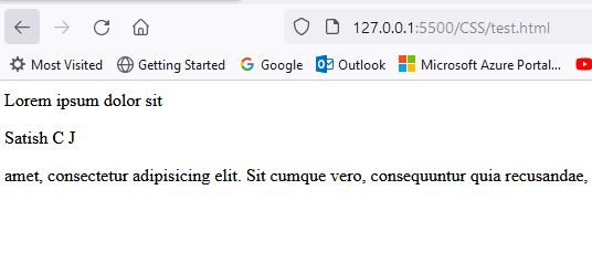
What is display property in CSS?
In the realm of CSS, the display property reigns supreme in orchestrating how elements appear and behave on a webpage.
Common Display Values
- Block: Elements occupy the full width of their container and create new lines (e.g.,
<div>,<p>,<h1>-<h6>). - Inline: Elements flow within the content like text, without line breaks (e.g.,
<span>,<a>,<img>). - None: Elements are hidden, but still take up space in the layout.
- Inline-block: Elements behave like inline elements but can have width and height set.
- Flex: Elements become flex items, enabling flexible layouts using the Flexbox model.
- Grid: Elements become grid items, enabling grid-based layouts using the CSS Grid model.
HTML Code for Display Property Demo
 <!DOCTYPE html>
  <html lang="en">
  <head>
    <meta charset="UTF-8">
    <meta http-equiv="X-UA-Compatible" content="IE=edge">
    <meta name="viewport" content="width=device-width, initial-scale=1.0">
    <link rel="stylesheet" href="test.css">
    <title>Document</title>
  </head>
  <body>
  Lorem ipsum dolor sit <p>Satish C J</p>amet, consectetur adipisicing elit. Sit cumque vero, consequuntur quia recusandae, ducimus error quod voluptatibus quam quos nesciunt officiis odio sint corporis, quidem iure architecto placeat id.
  </body>
  </html>
CSS File for Display Property in CSS
p
  {
  display: block;
  /* other variations of display given below
  display:inline;
  display: inline-block;*/
  }
Output
Introduction to Float Property in CSS
the float property offers a unique way to maneuver elements within a layout. It's like giving elements the ability to drift and align themselves along the edges of their container, creating flexible arrangements that break free from the traditional top-to-bottom flow.
Common Values:
- left: Floats an element to the left.
- right: Floats an element to the right.
- none: The default value, elements follow the normal layout flow.
CSS Float Property Demo Code
HTML Code for Float Property
<!DOCTYPE html>
  <html lang="en">
  <head>
    <meta charset="UTF-8">
    <meta http-equiv="X-UA-Compatible" content="IE=edge">
    <meta name="viewport" content="width=device-width, initial-scale=1.0">
    <link rel="stylesheet" href="test.css">
    <title>Document</title>
  </head>
  <body>
  <div>
    <img src="images/caption.JPG" alt="its a table">
    Lorem ipsum dolor sit amet consectetur adipisicing elit. Deserunt laboriosam maxime similique saepe animi consequatur molestiae, a exercitationem quia ducimus ratione quaerat laudantium nisi blanditiis est quam. Nihil, hic aperiam?
    Lorem ipsum dolor sit amet, consectetur adipisicing elit. In id officia rem deleniti labore consectetur suscipit, iste autem dolore nesciunt est laboriosam doloribus cupiditate exercitationem magni, sit, esse quae nemo!
    Lorem ipsum dolor sit, amet consectetur adipisicing elit. Animi saepe voluptates eum quas vero deleniti quasi ex excepturi nihil dolorum! Illum inventore dolore repellendus. Atque neque tempore reprehenderit magnam ut.
    Lorem ipsum dolor sit amet consectetur adipisicing elit. Dolorem in animi, sint exercitationem magni et architecto dicta nobis maiores ab explicabo, nulla nam facere ea veritatis possimus? Fugit, dolorum necessitatibus!
  </div>
  </body>
  </html>
CSS File for float property
img
{
border: 2px solid blue;
padding: 20px;
margin:20px;
float:right;
}

div
{
text-align: justify;
height: 320px;
width: 500px;
background-color: aqua;
}
Output
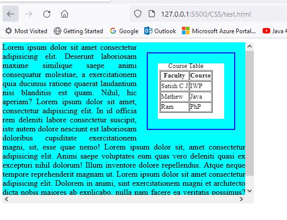
Overflow Property in CSS
The overflow property manages the flow of content within its designated containers. It gracefully handles situations where content exceeds its boundaries, ensuring a smooth and visually pleasing experience for visitors.
Key Values to Control the Overflow:
- visible:The default value, allowing content to overflow without any visual cues or restrictions.
- hidden:Truncates overflowing content, concealing it completely.
- scroll:Adds scrollbars to the container, enabling users to access the hidden content by scrolling.
- auto:Intelligently displays scrollbars only when content overflows.
CSS Overflow Property
HTML Code for Overflow Property
<!DOCTYPE html>
<html lang="en">
<head>
<meta charset="UTF-8">
<meta http-equiv="X-UA-Compatible" content="IE=edge">
<meta name="viewport" content="width=device-width, initial-scale=1.0">
<link rel="stylesheet" href="test.css">
<title>Document</title>
</head>
<body>
<div>
<img src="images/caption.JPG" alt="its a table">
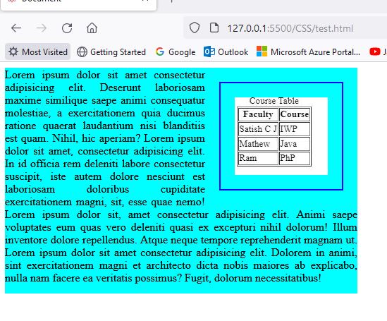
Lorem ipsum dolor sit amet consectetur adipisicing elit. Deserunt laboriosam maxime similique saepe animi consequatur molestiae, a exercitationem quia ducimus ratione quaerat laudantium nisi blanditiis est quam. Nihil, hic aperiam?
Lorem ipsum dolor sit amet, consectetur adipisicing elit. In id officia rem deleniti labore consectetur suscipit, iste autem dolore nesciunt est laboriosam doloribus cupiditate exercitationem magni, sit, esse quae nemo!
Lorem ipsum dolor sit, amet consectetur adipisicing elit. Animi saepe voluptates eum quas vero deleniti quasi ex excepturi nihil dolorum! Illum inventore dolore repellendus. Atque neque tempore reprehenderit magnam ut.
Lorem ipsum dolor sit amet consectetur adipisicing elit. Dolorem in animi, sint exercitationem magni et architecto dicta nobis maiores ab explicabo, nulla nam facere ea veritatis possimus? Fugit, dolorum necessitatibus!
</div>
</body>
</html> CSS File for overflow property
img
{
border: 2px solid blue;
padding: 20px;
margin:20px;
float:right;
}

div
{
text-align: justify;
height: 320px;
width: 500px;
background-color: aqua;
overflow: scroll;
/* other variations of overflow
overflow-x:scroll ;
overflow-y:scroll ;
overflow-y:auto ;*/
}
Output