CSS Transform - Transition and Animation property
CSS Transform - Transition and Animation property
What is a transform Property in CSS
The transform property in CSS is a powerful tool that allows you to manipulate the visual appearance of an element by rotating, scaling, skewing, or translating it. This can be used to create a variety of effects, from simple animations to complex 3D transformations.
Here are some of the things you can do with transform:
- Scale elements: You can make an element larger or smaller. This can be used to create zoom effects or to resize elements to fit different screen sizes.
- Skew elements: You can distort an element by shearing it horizontally or vertically. This can be used to create tilted or stretched effects.
- Translate elements: You can move an element from its original position without changing its size or rotation. This can be used to create animations or to position elements in specific locations.
The transform property is used in conjunction with a number of different functions, such as rotate(), scale(), skew(), and translate(). These functions take various arguments that you can use to control the specific transformation that is applied.
What is translate in CSS?
The transform property in CSS is a powerful tool for manipulating the visual appearance of elements on your web page. And one of its most versatile functions is translate(), which allows you to move elements around without changing their size or rotation.
translate() takes one or two arguments, representing the horizontal and vertical distances you want to move the element. These distances can be specified in various units like pixels, percentages, or even viewport units (vh, vw).
Here's the basic syntax:
transform: translate(x, y); y: Distance to move the element vertically (positive moves down, negative moves up)
What is animation property in CSS?
The animation property in CSS is your key to injecting dynamism and interactivity into your web pages. It allows you to seamlessly transition elements between different states, creating engaging animations that capture attention and enhance user experience.
animation is actually a shorthand property encompassing several sub-properties:
- animation-name: Specifies the animation you want to apply (defined in a separate @keyframes rule).
- animation-duration:Determines how long the animation takes to complete (specified in seconds or milliseconds).
- animation-timing-function: Defines the pacing of the animation.
- animation-delay:Controls when the animation starts relative to the element's appearance
The true magic of CSS animation lies in keyframes. These are like snapshots of the animation at different points in time, defining how the element's properties (like color, opacity, or transform) change throughout the animation sequence.
Imagine your element morphing from a square to a circle: you'd have keyframes for the starting square shape, the intermediate rounded corners, and the final circular form. Each keyframe specifies the desired property values at that specific point in time.
Rotating Divs using CSS
HTML Code
<!DOCTYPE html>
<html lang="en">
<head>
<meta charset="UTF-8">
<meta http-equiv="X-UA-Compatible" content="IE=edge">
<meta name="viewport" content="width=device-width, initial-scale=1.0">
<title<Document</title>
<link rel="stylesheet" href="test.css">
</head>
<body>
<div class="d1">
</div>
<div class="d2">
</div>
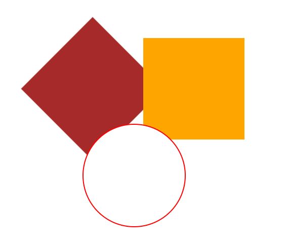
<div class="c1">
</div>
</body>
</html> CSS File
  .d1
  {
     background-color: brown;
     height: 200px;
     width: 200px;
     position:absolute;
     left:200px;
     top:100px;
     transform: rotate(45deg);
     animation-name: clock;
     animation-iteration-count: infinite;
     animation-duration: 4s;
  }
  .d2
  {
     background-color:orange;
     height: 200px;
     width: 200px;
     position:absolute;
     left:200px;
     top:100px;
     animation-name: counter;
     animation-iteration-count: infinite;
     animation-duration: 4s;
  }
  .c1
  {
      border-radius: 50%;
      background-color: white;
      border:2px solid red;
      height: 200px;
      width:200px;
      position:absolute;
      left:200px;
      top:100px;
  }
  @keyframes clock{

      from
      {
          transform: rotate(0deg);

      }
      to
      {
          transform: rotate(360deg);
      }
  }

  @keyframes counter{

      from
      {
          transform: rotate(0deg);
      }
      to
      {
          transform: rotate(-360deg);
      }
  }
Output

Moving Div's using CSS
HTML Code
<!DOCTYPE html>
<html lang="en">
<head>
  <meta charset="UTF-8">
  <meta http-equiv="X-UA-Compatible" content="IE=edge">
  <meta name="viewport" content="width=device-width, initial-scale=1.0">
  <title<Document</title>
  <link rel="stylesheet" href="test.css">
</head>
<body>
  <div class="d1">

  </div>
  <div class="d2">

  </div>
  <div class="c1">

  </div>
</body>
</html>
CSS File
.d1
{
   background-color: brown;
   height: 200px;
   width: 200px;
   position:absolute;
   left:200px;
   top:100px;
   transform: rotate(45deg);
   animation-name: clock;
   animation-iteration-count: infinite;
   animation-duration: 4s;
}
.d2
{
   background-color:orange;
   height: 200px;
   width: 200px;
   position:absolute;
   left:500px;
   top:100px;
   animation-name: counter;
   animation-iteration-count: infinite;
   animation-duration: 4s;
}
.c1
{
    border-radius: 50%;
    background-color: white;
    border:2px solid red;
    height: 200px;
    width:200px;
    position:absolute;
    left:200px;
    top:520px;
   animation-name: round;
   animation-iteration-count: infinite;
   animation-duration: 4s;
}
@keyframes clock{
    0%{
        left:0px;
    }
    100%
    {
     left:200px;
    }
}

@keyframes counter{

    0%{
        left:500px;
    }
    100%
    {
     left:200px;
    }
}

@keyframes round{
    0%{
        top:520px;
    }
    100%
    {
     top:100px;
     left:200px;
    }
}
Output
Text Animation using CSS
HTML Code
<!DOCTYPE html<
<html lang="en">
<head>
<meta charset="UTF-8">
<meta http-equiv="X-UA-Compatible" content="IE=edge">
<meta name="viewport" content="width=device-width, initial-scale=1.0">
<title<Document</title>
<link rel="stylesheet" href="test.css">
</head>
<body>
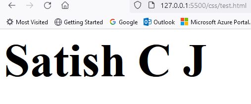
<div class="d1">
Satish C J
</div>
</body>
</html> CSS File
  .d1
  {
      animation:sat 5s infinite;
      font-size: medium;
  }

  @keyframes sat
  {
      from{
          font-size: medium;
      }
      to
      {
          font-size:100px;
          font-weight: bold;
      }
  }
Output
Text color change Animation using CSS
HTML Code
<!DOCTYPE html<
<html lang="en">
<head>
<meta charset="UTF-8">
<meta http-equiv="X-UA-Compatible" content="IE=edge">
<meta name="viewport" content="width=device-width, initial-scale=1.0">
<title<Document</title>
<link rel="stylesheet" href="test.css">
</head>
<body>
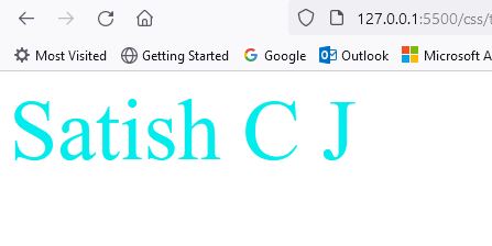
<div class="d1">
Satish C J
</div>
</body>
</html> CSS File
.d1
{
    animation:sat 10s infinite;
    font-size: medium;
}

@keyframes sat
{
    0% {
        color:red;font-size: 20px;top:20px;
    }
    25% {
        color:blue;font-size: 40px;top:100px;
    }
    75% {
        color:black;font-size: 60px;top:200px;
    }
    100% {
        color:aqua;font-size: 80px;top:300px;
    }
}
Output
Background Color change Animation using CSS
HTML Code
<!-- Exercise 1 - Background color change animation-->
<!DOCTYPE html>
<html lang="en">
<head>
<meta charset="UTF-8">
<meta http-equiv="X-UA-Compatible" content="IE=edge">
<meta name="viewport" content="width=device-width, initial-scale=1.0">
<title<CSS Transform and Transition</title>
<link rel="stylesheet" href="test.css">
</head>
<body>
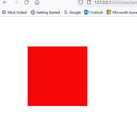
<div class="d1">
</div>
</body>
</html> CSS File
  .d1
{
    background-color: aqua;
    height: 200px;
    width: 200px;
    position:absolute;
    top:100px;
    left:100px;
    animation-name: satish;
    animation-duration: 5s;
    animation-iteration-count: infinite;
}

@keyframes satish
{
    from
    {
        background-color: aqua;
    }
    to
    {
         background-color: red;
    }
}
Output
Exercise - Background Color change using percentage in CSS
HTML Code
<!DOCTYPE html>
      <html lang="en">
      <head>
        <meta charset="UTF-8">
        <meta http-equiv="X-UA-Compatible" content="IE=edge">
        <meta name="viewport" content="width=device-width, initial-scale=1.0">
        <title<CSS Transform and Transition</title>
        <link rel="stylesheet" href="test.css">
      </head>
      <body>
       <div class="d1">

       </div>
      </body>
      </html>
CSS File
.d1
      {
          background-color: blue;
          height: 200px;
          width: 200px;
          position:absolute;
          top:100px;
          left:10px;
          animation-name: satish;
          animation-duration: 10s;
          animation-iteration-count: 1;
      }
      @keyframes satish
      {
          0%{background-color:blue;}
          25%{background-color:red;}
          50%{background-color:aqua;}
          100%{background-color:brown;}
      }
Output

Exercise on rotating a div element using CSS
HTML Code
<!DOCTYPE html>
  <html lang="en">
  <head>
    <meta charset="UTF-8">
    <meta http-equiv="X-UA-Compatible" content="IE=edge">
    <meta name="viewport" content="width=device-width, initial-scale=1.0">
    <title<CSS Transform and Transition</title>
    <link rel="stylesheet" href="test.css">
  </head>
  <body>
   <div class="d1">

   </div>
  </body>
  </html>
CSS File
  .d1
  {
      background-color: aqua;
      height: 200px;
      width: 200px;
      position:absolute;
      top:100px;
      left:100px;
      animation-name: satish;
      animation-duration: 5s;
      animation-iteration-count: infinite;
  }

  @keyframes satish
  {
      from
      {
          transform: rotate(0deg);
      }
      to
      {
        transform: rotate(360deg);
      }
  }
Output

Exercise on translating an element using CSS
HTML Code
<!-- Exercise 1 - Background color change animation-->
      <!DOCTYPE html>
      <html lang="en">
      <head>
        <meta charset="UTF-8">
        <meta http-equiv="X-UA-Compatible" content="IE=edge">
        <meta name="viewport" content="width=device-width, initial-scale=1.0">
        <title<CSS Transform and Transition</title>
        <link rel="stylesheet" href="test.css">
      </head>
      <body>
       <div class="d1">

       </div>
      </body>
      </html>
CSS File
      .d1
      {
          background-color: aqua;
          height: 200px;
          width: 200px;
          position:absolute;
          top:100px;
          left:100px;
          animation-name: satish;
          animation-duration: 5s;
          animation-iteration-count: infinite;
      }

      @keyframes satish
      {
          from
          {
              transform: translate(100px,100px);
          }
          to
          {
              transform: translate(300px,100px);
          }
      }
Output

Background Color change Animation using CSS
HTML Code
<!-- Exercise 1 - Background color change animation-->
          <!DOCTYPE html>
          <html lang="en">
          <head>
            <meta charset="UTF-8">
            <meta http-equiv="X-UA-Compatible" content="IE=edge">
            <meta name="viewport" content="width=device-width, initial-scale=1.0">
            <title<CSS Transform and Transition</title>
            <link rel="stylesheet" href="test.css">
          </head>
          <body>
           <div class="d1">

           </div>
          </body>
          </html>
CSS File
          .d1
        {
            background-color: aqua;
            height: 200px;
            width: 200px;
            position:absolute;
            top:100px;
            left:100px;
            animation-name: satish;
            animation-duration: 5s;
            animation-iteration-count: infinite;
        }

        @keyframes satish
        {
            from
            {
                background-color: aqua;
            }
            to
            {
                 background-color: red;
            }
        }
Output